Portfolio
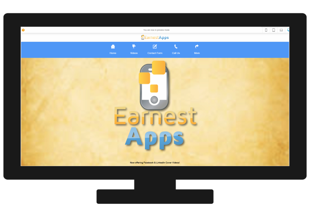
One of the really great features of a PWA is its ability to display beautifully on screens of all sizes. Whether it’s on a mobile phone or a desktop computer, your app will look beautiful for all users.

Mobile Phone
On a mobile phone, the images and font size appropriately to fill the screen and look attractive to users. The navigation bar can be positioned along the bottom as it is here, or vertically, and can be hidden or always visible depending on preferences.
Tablet
On a tablet the images and font are larger and still fill the screen. The navigation bar remains in the same spot as on the mobile phone size.


Desktop
On the desktop version, your PWA adjusts to perfectly fit the screen. The navigation bar moves to the top of the page for easy user access. Images and font resize appropriately for a beautiful look.
Other Work

Castle in the Country Bed & Breakfast Suites

Moon Shine Cleaning Products

GRAPE Networking App for professionals

Andrea Zoet - Realtor for Greenridge Realty

Grand Rapids Business Exchange

Prairieside Luxure Suites Trip Planner

Fred's Italian Restaurant

Kane Mostyn Insurance Agency

Prince Insurance Agency

West Michigan Club House

CYA Support for the SMB Market

Blue Pond Marketing - Getting Clients Known

Have a Project in Mind?
Contact us to share your details and start desiging your custom Progressive Web App.
